Well, this is a surprise. For the first time EVER, Pantone, the official colour trend forecasters, have announced not one but two official colours of the year. Well not exactly two separate colours, but more specifically the colour of 2016 is a blending of the two shades.

The colour selections are decided well in advance of the season after careful trend mapping and tracking pop culture and major events. They seek out shades around the globe that will peek consumers interest, ultimately predicting consumer spending and in doing so, they pinpoint what colours will be the standouts in upcoming years.


I am admittedly, a Pantone lover. I have blogged a few times about Pantone’s official colour selections as I find it not only a fascinating process, but also that it exists at all. Imagine your job was to travel the world and study trends, events, culture, music, food, etc. and predict new colours and trending tones.


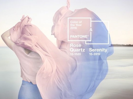
Rose Quartz and Serenity are 2016’s colours of the year. At first glance, I found them underwhelming but they grew on me. On their own they aren’t that compelling. Even paired together side by side they don’t win me over. However, as usual, Pantone nailed it by merging the two together. The colours sing when blended and perfectly complement eachother.

I can’t help but think that Pantone must have picked up some inspiration from the current watercolour trend. When you watch the video seen here on the Pantone website, you see how well the colours flow together like liquid.

For a wedding, how beautiful would Rose Quartz and Serenity be when combined with soft sage and muted greenery or blended together on stationery in watercolours. We can’t wait to see these colours in our weddings this year and to see how brides utilize the colours each season.

What do you think of Rose Quartz and Serenity? Do you like Pantone’s idea to announce them as a blend instead of a stand alone colour? Do you prefer one colour over another? How do you think it compares to last year’s Marsala – my all time favourite Pantone colour. Share in the comment section. We love to hear from you!