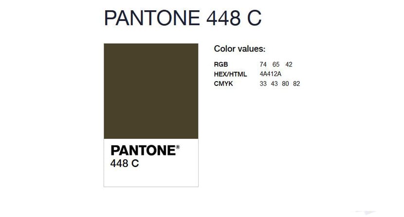
Today, Pantone has released a different kind of colour though, colour number 448 C, also known as Opaque Couche.

Instead of searching the world for colour trends to release the official colour of the year or colours of the season, they have released the world’s ugliest colour – the complete opposite of their normal task of researching hot, up and coming colours in fashion and design. Now, before you tilt your head sideways in confusion, it’s for a purpose. In honour of World No Tobacco Day, Pantone released the colour in an effort to dissuade smoking. Australian market research firm, GfK Bluemoon, hired Pantone to research a colour that would represent smoking and if included on a package of cigarettes, would discourage smokers from buying a pack. Opaque Couche is described as, “death, dirty and tar”. It’s an olive/army green tone with dark brown hues.

Hilariously to me, I like this colour. I love olive green in the summer time, it pairs well with both soft and vibrant tones and looks great with a summer tan! And ironically, despite being dubbed the ugliest colour in the world, it has been featured quite often in high fashion collections and also in many weddings – a quick Pinterest search will showcase the colour beautifully. But I digress. I do agree that when used on packaging, it isn’t the most appealing colour and doesn’t exactly jump out to a consumer on the shelf – especially when paired with the graphic warning images currently on cigarette packs.

GfK Bluemoon, who headed the initiative, said this of the colour “We didn’t want to create attractive, aspirational packaging designed to win customers…Instead our role was to help our client reduce demand, with the ultimate aim to minimize use of the product.’’ GfK Bluemoon conducted a thorough study which confirmed that ‘‘drab dark brown’’ packages had the lowest overall appeal and looked like they would contain the lowest quality cigarettes, which would cause the most harm. Lime green, white, beige, dark grey and mustard were also considered, however Opaque Couch, aka Pantone 448C, had the highest ability to “minimize appeal” and “maximize perceived harm”.

A great initiative for a great cause and a great excuse to write about Pantone again! Side note – also a great reminder that I have not yet written about 2016’s colour of the year (shocking, I know. Probably because I’m having a hard time giving up my ultimate favourite colour of the year, 2015’s Marsala) so keep an eye out for that post coming soon on the Brightside Films blog!